Brand Icons

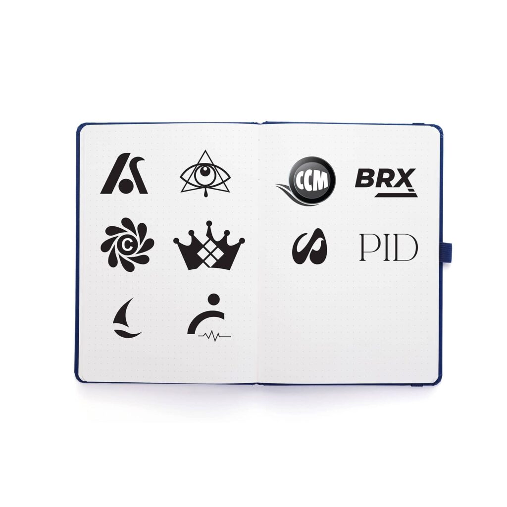
Brand Icons The Essence of Identity, Simplified. A curated collection of brand icons developed through a blend of client collaborations, coursework, and content creation. Each icon is purpose-driven, crafted to align seamlessly with its brand’s identity. From extensive research to iterative design processes, these icons were created in partnership with clients to achieve distinctive and memorable marks that resonate with their audiences. Year: 2020-2023 Project Type: Client Collaboration Role: Lead Designer Brand Icons The Essence of Identity, Simplified. A curated collection of brand icons developed through a blend of client collaborations, coursework, and content creation. Each icon is purpose-driven, crafted to align seamlessly with its brand’s identity. From extensive research to iterative design processes, these icons were created in partnership with clients to achieve distinctive and memorable marks that resonate with their audiences. Year: 2020-2023 Project Type: Client Collaboration Role: Lead Designer Objective Client Collaboration: Work closely with clients to translate their vision and goals into effective visual marks. The Process The brand icon design process ensures clarity and creativity, starting with research to align with the client’s goals and audience. Ideas are developed through brainstorming and iteration, with feedback refining the concepts. Final designs are polished for scalability and versatility, resulting in icons that are functional, visually engaging, and aligned with the brand’s message. Mood Board Accordion Title Accordion Content Research The design process for brand icons is structured to ensure clarity, collaboration, and creativity. It begins with thorough research and discovery, identifying the client’s goals, understanding their target audience, and analyzing competitors to uncover opportunities for differentiation. This step lays the foundation for aligning the design with the brand’s purpose and message. Ideation & Conceptualization The ideation and conceptualization phase explores initial ideas through brainstorming and sketching. Multiple iterations are created, experimenting with shapes, styles, and elements to refine the concept into a cohesive design. Throughout this phase, feedback loops with clients ensure that the work stays aligned with their vision while incorporating valuable insights Refinement and application The final stage involves refinement and application, where selected designs are polished and prepared for deployment. Icons are tested for scalability and versatility, ensuring they work seamlessly across various media and applications. The result is a set of icons that not only meet functional requirements but also resonate visually and emotionally with the intended audience. Previous Project Previous Project A print ad concept created to showcase the airport’s community impact, blending historical significance with its role as an economic and cultural cornerstone. Next Project Next Project A series of :15 spots for clients like Culligan and Santa Maria Airport, blending production and motion design to craft impactful, captivating visuals.
MinuteMaid

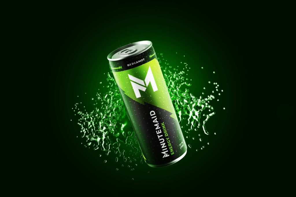
MinuteMaid Refreshing Tradition, Minute Maid’s Evolution for Tomorrow’s Tastes After 75 years of delivering goodness, Minute Maid has expanded its beverage line to meet evolving consumer needs. With additions like Minute Maid Zero Sugar, Smoothie, and Energy, the company seeks a new identity and packaging design to reflect its future offerings. Year: 2020 Project Type: Coursework Produced: Independently MinuteMaid Refreshing Tradition, Minute Maid’s Evolution for Tomorrow’s Tastes After 75 years of delivering goodness, Minute Maid has expanded its beverage line to meet evolving consumer needs. With additions like Minute Maid Zero Sugar, Smoothie, and Energy, the company seeks a new identity and packaging design to reflect its future offerings. Year: 2020 Project Type: Coursework Produced: Independently Objective To revitalize the Minute Maid logo and create a dynamic, eye-catching packaging system for the new beverage line—Minute Maid Energy, aligning the brand’s identity with its innovative offerings. Research Research is essential to my design process, helping me understand the subject and audience. I start with a clear plan to guide a focused approach. This market understanding and awareness of trends shape my design decisions, ensuring they are relevant and effective. You can view the complete market research here. Market Research Accordion Title Accordion Content Research Goals Understand the market of beverages related to energy drinks Identify the target audience of Minute Maid Learn about how the main competitors of Minute Maid are catering to customers’ needs Understand the problem related to the current logo design Identify the visual language related to energy drinks. Research Questions Who are the target audiences? Who are the main competitors of MinuteMaid, and how do they serve the consumers? What are some of the common features of the beverage? What are some of the reasons for buying the product? How do people find beverages they would like to drink? Methodologies Primary Research Market Research – Understand the industry related to energy drinks, as well as the target audience Competitive Analysis – Learn about how the main competitors of MinuteMaid and how they are catering to customers’ needs, as well as their strengths and weaknesses Secondary Research Learn about the problem regarding the current Minute Maid logo, the insights, and needs Competitive Research It is equally important to research enterprises that pioneer in the market of platforms related to energy drinks, as their solutions to similar problems will help me gather insights about their strengths and weaknesses. A complete competitive research can be viewed here. The why… Now that I’ve gathered enough research about the industry and competitors, I can revisit the current Minute Maid logo and analyze the problem. What I noticed was that the logo appeared outdated, complex, and visually cluttered compared to its competition. Likewise, the logo is hard to read in small sizes due to its typography and surrounding elements. An optimal logo would have to be memorable and work in any size across multiple applications. Accordion Title Accordion Content Mind Map Taking the HMW questions, I started my brainstorming process to come up with solutions for each of these problems. I decided to use mind mapping so that I could quickly generate as many ideas as I could. This is an extract of my brainstorm results. Insights Simplicity: The logo should be straightforward and uncluttered. Geometric Elements: Incorporate geometric shapes, with a preference for squares and diagonal lines, to convey structure and stability. Dynamic and Modern: The design should feel energetic and up-to-date, resonating with a contemporary audience. Power and Speed: The design should evoke a sense of power, speed, and quickness, possibly through the use of sharp lines, vibrant colors, and dynamic shapes. Lighting and Batteries: Visual elements like lightning bolts or battery symbols can be used to represent energy and vitality. Vibrancy: A strong, vibrant color palette will help the design stand out and communicate the product’s energizing qualities. Demographics: Focus on a serious, quick, and modern audience, primarily within the 18-34 age range. Aesthetic Preferences: Dark tones and sleek, modern aesthetics should appeal to the target demographic, aligning with their tastes and expectations. Mood board To support my insights, I created a mood board inspired by my research to capture the overall visual style and tone. You can view the mood board here. Strategy To define the problem, I created Point-of-View (POV) Statements for goal-oriented ideation and How-Might-We (HMW) Questions to guide brainstorming sessions. These were developed based on insights and needs identified in my preliminary research. How-Might-We Design The new logo and packaging design rebrands Minute Maid with a modern, energetic twist. The bold, geometric “M” symbolizes simplicity and strength, perfectly aligning with the brand’s evolution. The packaging, inspired by the dynamic energy of batteries, uses vibrant colors and sharp lines to convey speed and intensity. This cohesive visual identity resonates with a contemporary audience, reflecting the innovative nature of Minute Maid’s energy drinks. Mood Board Accordion Title Accordion Content Sketches After gathering enough information about what and who I’m designing for, I started sketching ideas for the logo and packaging design. This enables me to quickly explore and review my concepts before adding them into a digital program. The Logo The logo design uses geometric shapes that merge the letter “M” and the number “1.” This combination produces a modern, simple, and memorable design that works well in various applications. Furthermore, the dynamic angles reinforce the idea of energy and progress. The Beverage Similar to batteries, energy drinks are used to provide energy. Based on this concept, the visuals of batteries served as the primary component for the design. It is powerful, dynamic, and vibrant. The new packaging design embodies consumers with a new way to view a product. The Carrier The carrier builds upon the idea of energy and movement. Because of this, I built the design using dynamic angles mixed with the visual language of lighting. Applications To show how the design works across different applications, I created 3D mockups. These mockups include different flavors of the beverages, a trade booth, and bottled merchandise. Fuel Your Ambition Universal Design Powerful,
VarmeCafe

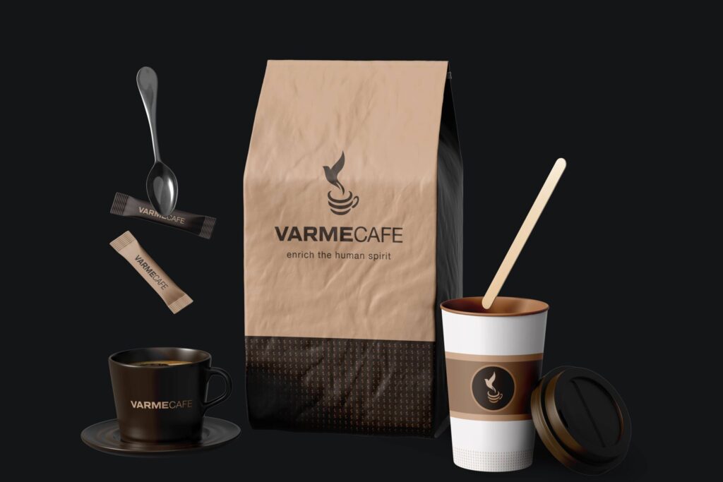
Varme Cafe Brewing Comfort, Redefining Identity Formerly Merry Hill Coffee & Teas, Varme Cafe in the Central Coast offers a wide range of drinks and meals. Despite its variety, the cafe has struggled to stand out. To address this, the business is rebranding to create a fresh identity that better connects with its community and stakeholders. Year: 2020 Project Type: Personal Project Produced: Independently Varme Cafe Brewing Comfort, Redefining Identity Formerly Merry Hill Coffee & Teas, Varme Cafe in the Central Coast offers a wide range of drinks and meals. Despite its variety, the cafe has struggled to stand out. To address this, the business is rebranding to create a fresh identity that better connects with its community and stakeholders. Year: 2020 Project Type: Personal Project Produced: Independently Objective To execute a thorough and strategic rebrand for Merry Hill Coffee & Teas, encompassing all aspects of its identity to better reflect its core values and connect with its audience. Research Research is essential to my design process, helping me understand the subject and audience. I start with a clear plan to guide a focused approach. This market understanding and awareness of trends shape my design decisions, ensuring they are relevant and effective. You can view the complete market research here. Market Research Gaming Habits Gamers 26-35 years old play for eight hours 12 minutes per week. This increased more than 25 percent in the last year. (Limelight Networks) Video gamers spend an average of 7.1 hours (seven hours, seven minutes) each week playing games. This is an increase of 19.3 percent in the last year. (Limelight Networks) Research Goals Understand the market of related to coffee shops Identify the target audience of Merry Hills Learn about how the main competitors of Merry Hills are catering to customers’ needs Understand the problem related to the current brand Identify the visual language related to coffee Research Questions Who is the target audiences? Who are the main competitors of Merry Hills, and how do they serve the consumers? What are some of the common features of coffee? What are some of the reasons for buying the coffee? How do people find coffee they would like to drink? Methodologies Primary Research Market Research – Understand the industry related to coffee shops, as well as the target audience Competitive Analysis – Learn about how the main competitors of Merry Hills and how they are catering to customers’ needs. Secondary Research Learn about the problem regarding the current brand. Competitive Research It is equally important to research enterprises that pioneer in the market of platforms related to coffee shops, as their solutions to similar problems will help me gather insights about their strengths and weaknesses. A complete competitive research can be viewed here. Insights Merry Hill’s lack of brand identity hinders the company’s growth. This becomes a problem when trying to diverge from the competition. Merry Hill’s has a busy logo and an absence of social media. These factors reinforce the idea that Merry Hill’s is outdated and unable to adapt. Comparisons Both Starbucks and Dunkin Donuts have a strong identity and cater to a specific audience. Starbucks focuses on the premium aesthetic while Dunkin Donuts offers a fast food appeal. Starbucks delivery is a perfect example of a quick to adapt mentality, which has enhanced the company’s ability to offer more for the customer. Both Starbucks and Dunkin Donuts memorable brand set it apart from other coffee shops, as well as the services and wide variety of products they provide. Both have short or catchy names that reinforce the memorable aspect of the companies. Needs A memorable name, logo and aesthetic to separate itself from its competition. An ideal message or tagline that appeals to an audience. A specific audience within the coffee shop demographics to provide the best customer service. Customer customization for an ideal experience. Accordion Title Accordion Content Mind Map Taking the HMW questions, I started my brainstorming process to come up with solutions for each of these problems. I decided to use mind mapping so that I could quickly generate as many ideas as I could. This is an extract of my brainstorm results. Insights Warm, spiritual, and satisfying. The idea was that the new identity would reflect the rewarding experience bestowed by the coffee shop. Varme Cafe would become the new identity of Merry Hills Coffee & Teams. The name translates from Danish to “Warm Coffee.” It is both, short and catchy. Varme Cafe’s aesthetic would focus on the comfort, relaxing, and casual experience. I pursued to accentuate the phrase “enrich the human spirit” as a memorable narrative to the brand. The slogan promotes the enriching qualities of the coffee shop as well as the humanistic and spiritual comfort that it offers. Mood Board To support my insights, I created a mood board inspired by my research to capture the overall visual style and tone. You can view the mood board here. Strategy To define the problem, I created Point-of-View (POV) Statements to guide goal-oriented ideation and How-Might-We (HMW) Questions to frame brainstorming sessions. These were developed based on insights and needs identified in my preliminary research. How-Might-We The Identity This design centers on calmness, warmth, and tranquility. The soft browns, beige, and warm neutrals create a relaxing, cozy café atmosphere. The dove, symbolizing peace, rises as steam from the coffee cup, perfectly aligning with the serene vibe. The overall design invites customers to unwind and enjoy a peaceful ambiance, reinforced by imagery of serene landscapes and quiet reflection. The combination of the dove and warm tones ensures the brand feels welcoming and comforting, making it an ideal space for individuals to enrich their spirit with a cup of coffee. Mood Board Accordion Title Accordion Content Sketches After gathering enough information about what and who I’m designing for, I started sketching ideas for the logo and brand. This enables me to quickly explore and review my concepts before adding them into a digital program. Logo of Design The design of the