MinuteMaid

MinuteMaid

Refreshing Tradition, Minute Maid's Evolution for Tomorrow's Tastes

After 75 years of delivering goodness, Minute Maid has expanded its beverage line to meet evolving consumer needs. With additions like Minute Maid Zero Sugar, Smoothie, and Energy, the company seeks a new identity and packaging design to reflect its future offerings.

Year: 2020

Project Type: Coursework

Produced: Independently

Mintemaid

Refreshing Tradition, Minute Maid's Evolution for Tomorrow's Tastes

After 75 years of delivering goodness, Minute Maid has expanded its beverage line to meet evolving consumer needs. With additions like Minute Maid Zero Sugar, Smoothie, and Energy, the company seeks a new identity and packaging design to reflect its future offerings.

Year: 2020

Project Type: Coursework

Produced: Independently

Objective

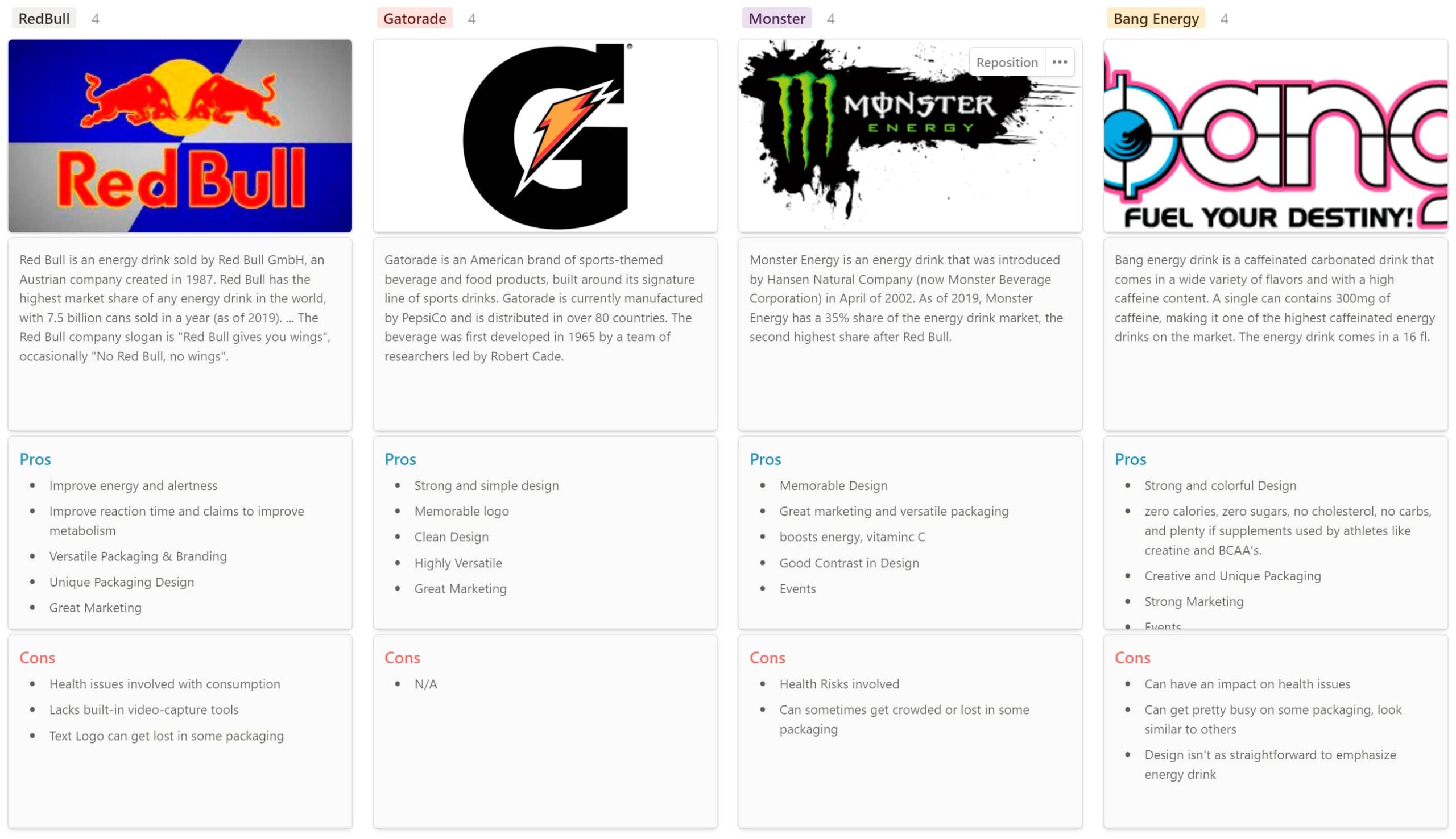
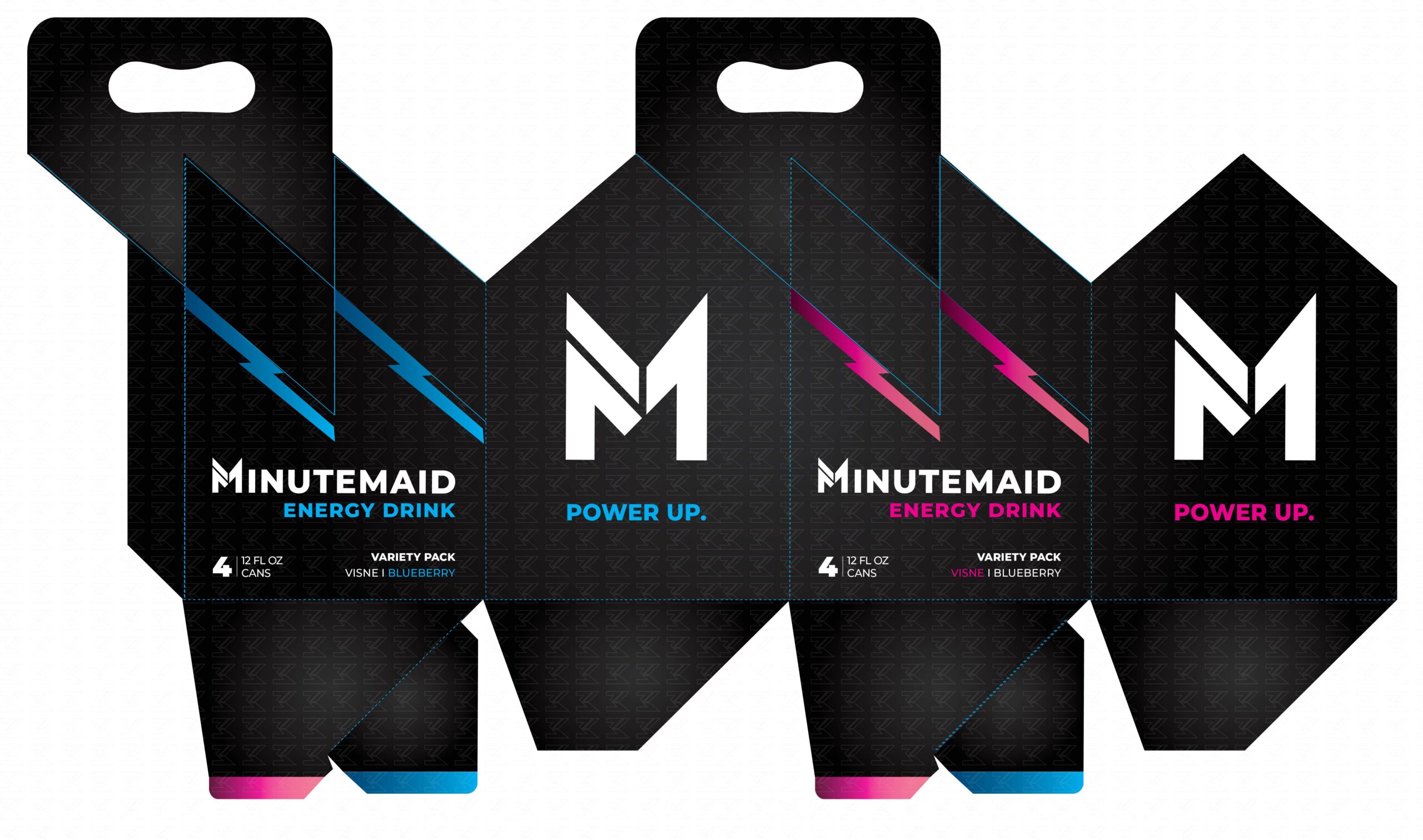
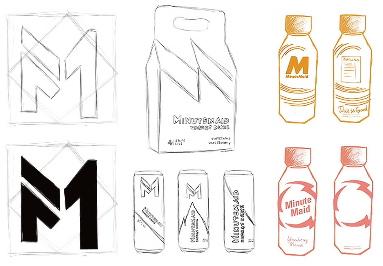
To revitalize the Minute Maid logo and create a dynamic, eye-catching packaging system for the new beverage line—Minute Maid Energy, aligning the brand’s identity with its innovative offerings.

Research

Research is essential to my design process, helping me understand the subject and audience. I start with a clear plan to guide a focused approach. This market understanding and awareness of trends shape my design decisions, ensuring they are relevant and effective. You can view the complete market research here.
Accordion Content
  • Understand the market of beverages related to energy drinks
  • Identify the target audience of Minute Maid
  • Learn about how the main competitors of Minute Maid are catering to customers’ needs
  • Understand the problem related to the current logo design
  • Identify the visual language related to energy drinks.
  • Who are the target audiences?
  • Who are the main competitors of MinuteMaid, and how do they serve the consumers?
  • What are some of the common features of the beverage?
  • What are some of the reasons for buying the product?
  • How do people find beverages they would like to drink?
Primary Research
  • Market Research – Understand the industry related to energy drinks, as well as the target audience
  • Competitive Analysis – Learn about how the main competitors of MinuteMaid and how they are catering to customers’ needs, as well as their strengths and weaknesses
Secondary Research
  • Learn about the problem regarding the current Minute Maid logo, the insights, and needs
  • It is equally important to research enterprises that pioneer in the market of platforms related to energy drinks, as their solutions to similar problems will help me gather insights about their strengths and weaknesses. A complete competitive research can be viewed here.
  • Now that I’ve gathered enough research about the industry and competitors, I can revisit the current Minute Maid logo and analyze the problem. What I noticed was that the logo appeared outdated, complex, and visually cluttered compared to its competition. Likewise, the logo is hard to read in small sizes due to its typography and surrounding elements. An optimal logo would have to be memorable and work in any size across multiple applications.
Accordion Content
  • Taking the HMW questions, I started my brainstorming process to come up with solutions for each of these problems. I decided to use mind mapping so that I could quickly generate as many ideas as I could. This is an extract of my brainstorm results.
  • Simplicity: The logo should be straightforward and uncluttered.
  • Geometric Elements: Incorporate geometric shapes, with a preference for squares and diagonal lines, to convey structure and stability.
  • Dynamic and Modern: The design should feel energetic and up-to-date, resonating with a contemporary audience.
  • Power and Speed: The design should evoke a sense of power, speed, and quickness, possibly through the use of sharp lines, vibrant colors, and dynamic shapes.
  • Lighting and Batteries: Visual elements like lightning bolts or battery symbols can be used to represent energy and vitality.
  • Vibrancy: A strong, vibrant color palette will help the design stand out and communicate the product’s energizing qualities.
  • Demographics: Focus on a serious, quick, and modern audience, primarily within the 18-34 age range.
  • Aesthetic Preferences: Dark tones and sleek, modern aesthetics should appeal to the target demographic, aligning with their tastes and expectations.

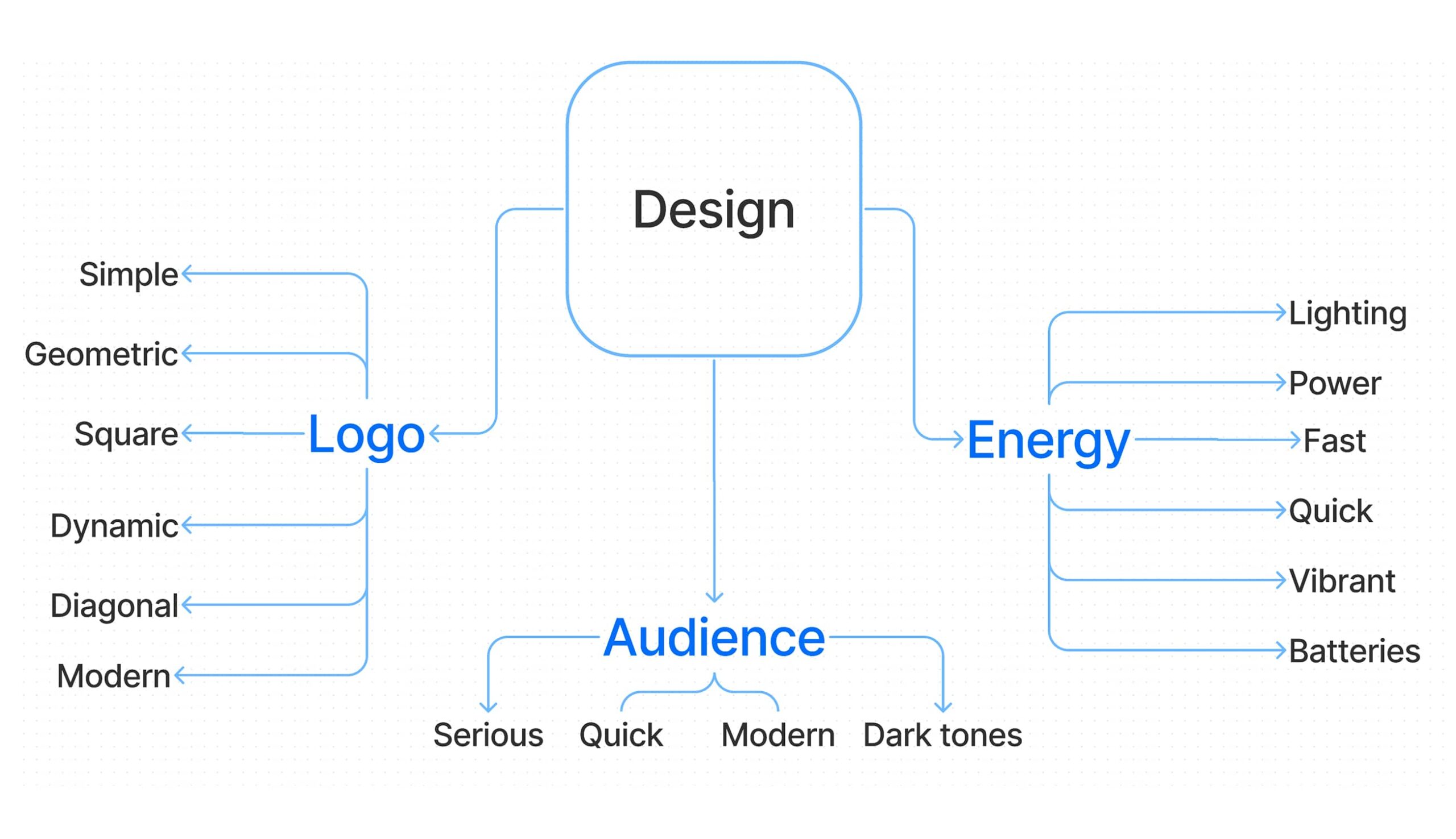
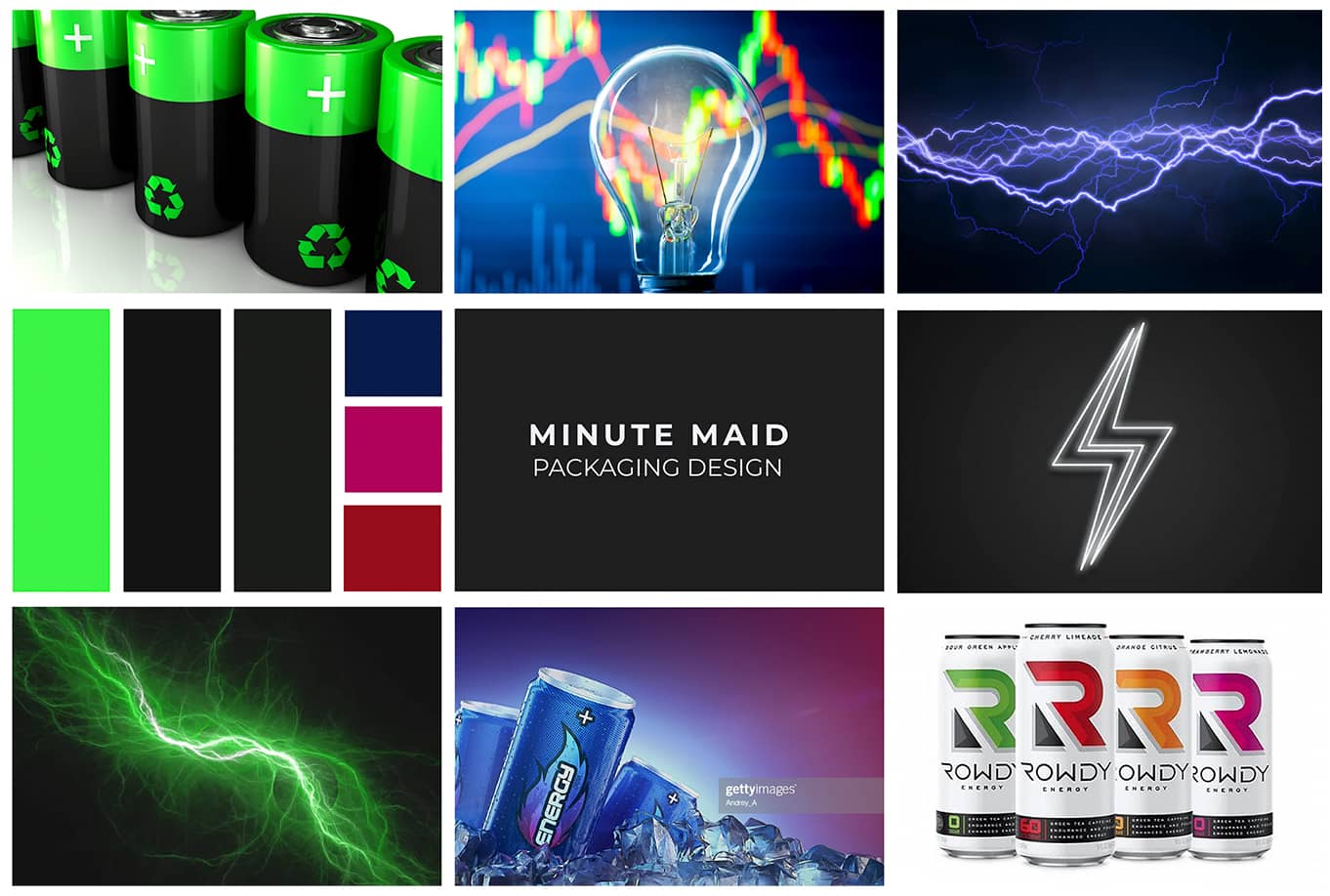
To support my insights, I created a mood board inspired by my research to capture the overall visual style and tone. You can view the mood board here.

Strategy

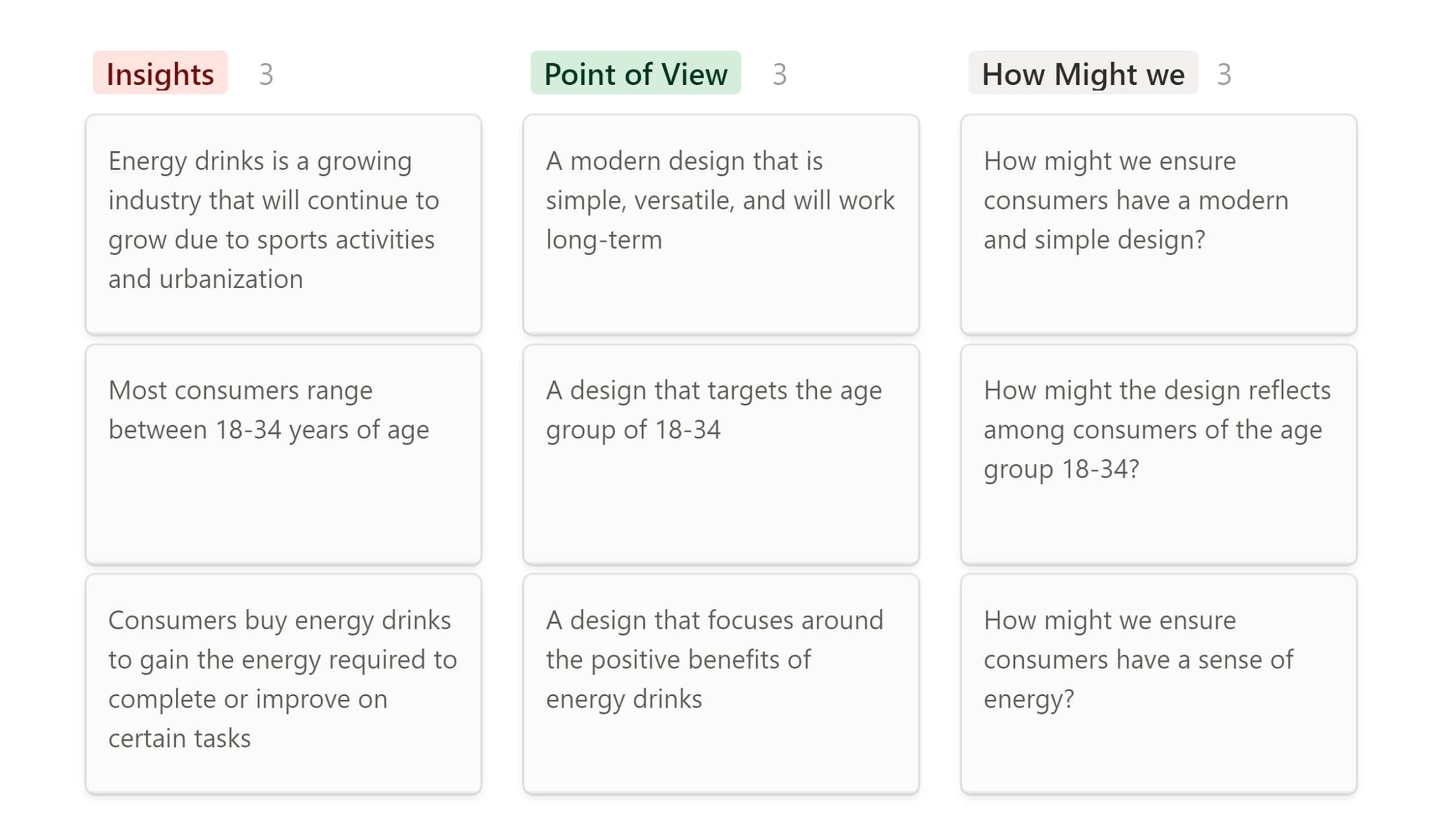
To define the problem, I created Point-of-View (POV) Statements for goal-oriented ideation and How-Might-We (HMW) Questions to guide brainstorming sessions. These were developed based on insights and needs identified in my preliminary research.

Design

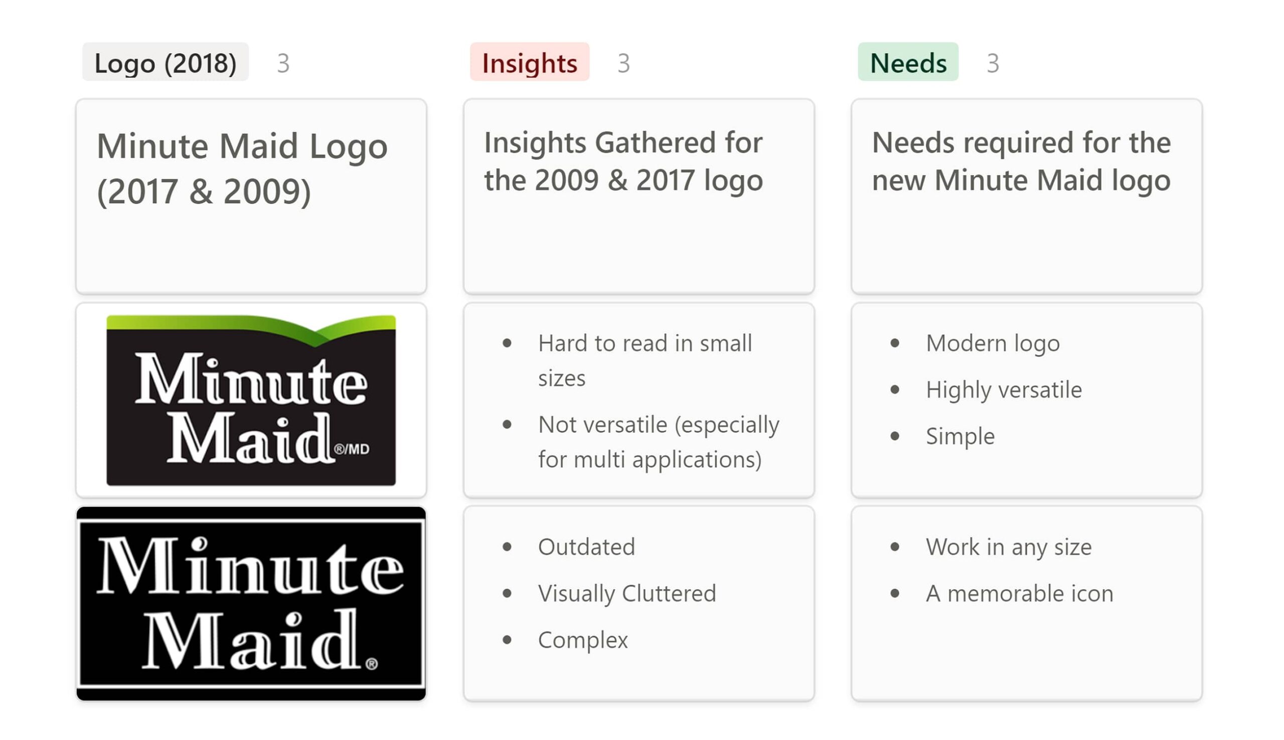
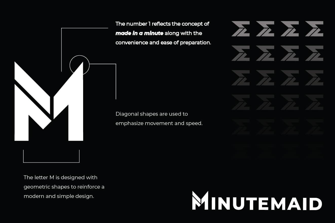
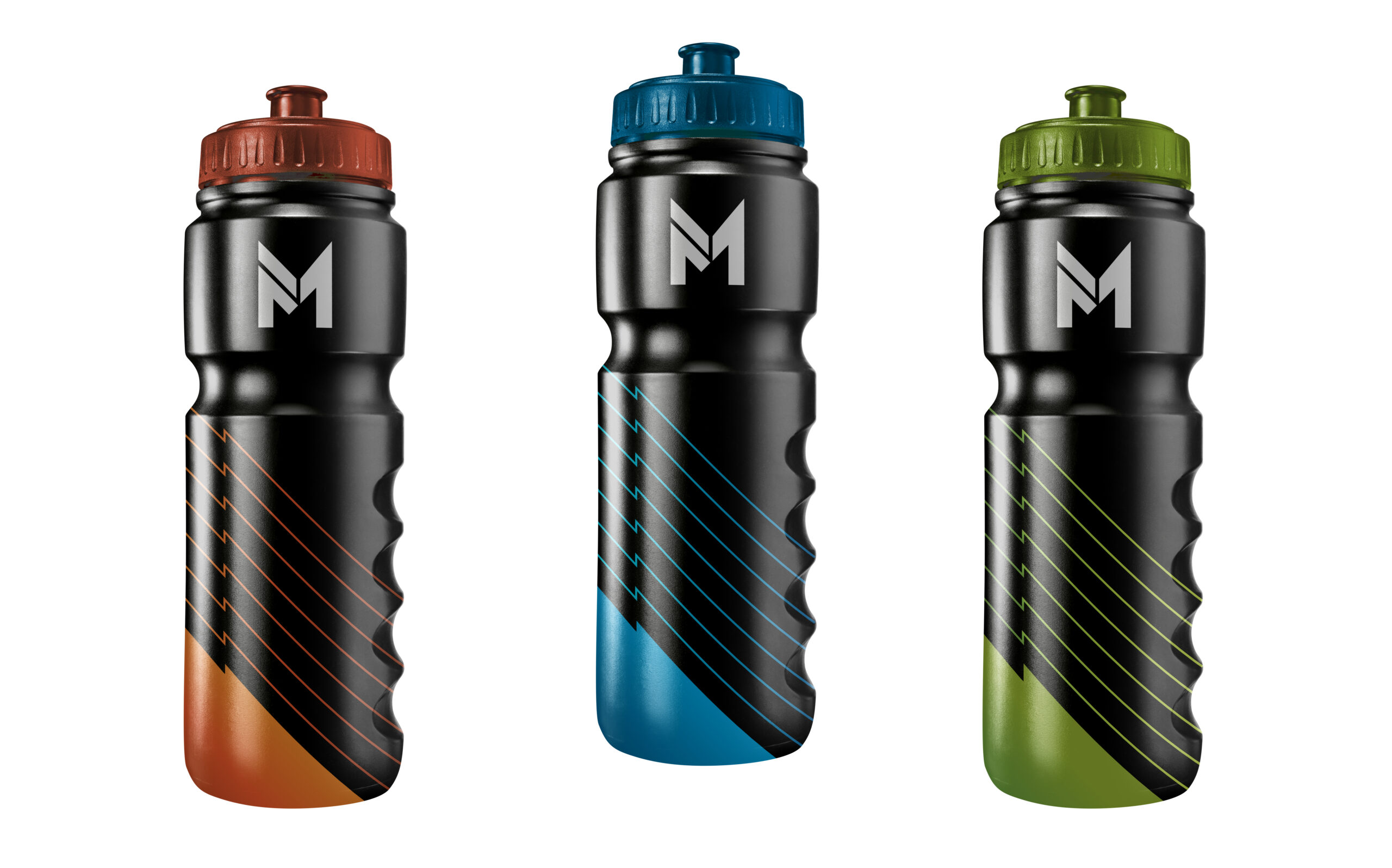
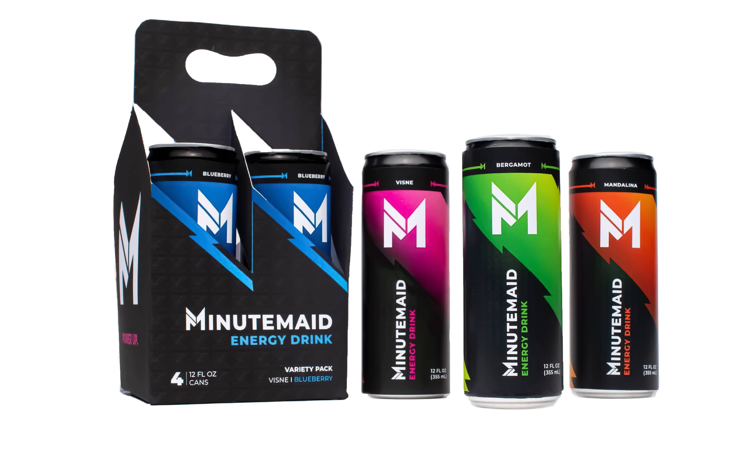
The new logo and packaging design rebrands Minute Maid with a modern, energetic twist. The bold, geometric “M” symbolizes simplicity and strength, perfectly aligning with the brand’s evolution. The packaging, inspired by the dynamic energy of batteries, uses vibrant colors and sharp lines to convey speed and intensity. This cohesive visual identity resonates with a contemporary audience, reflecting the innovative nature of Minute Maid’s energy drinks.

Accordion Content
  • After gathering enough information about what and who I’m designing for, I started sketching ideas for the logo and packaging design. This enables me to quickly explore and review my concepts before adding them into a digital program.
  • The logo design uses geometric shapes that merge the letter “M” and the number “1.” This combination produces a modern, simple, and memorable design that works well in various applications. Furthermore, the dynamic angles reinforce the idea of energy and progress.
  • Similar to batteries, energy drinks are used to provide energy. Based on this concept, the visuals of batteries served as the primary component for the design. It is powerful, dynamic, and vibrant. The new packaging design embodies consumers with a new way to view a product.
  • The carrier builds upon the idea of energy and movement. Because of this, I built the design using dynamic angles mixed with the visual language of lighting.
  • To show how the design works across different applications, I created 3D mockups. These mockups include different flavors of the beverages, a trade booth, and bottled merchandise.
Fuel Your Ambition
Universal Design
Powerful, Versatile.
Simple, Modern, Dynamic.

Powerful, Versatile.

Previous Project

Dive into the creation of Feed the Bear, a puzzle game where you help a bear gather food for hibernation.

Next Project

Explore the guidebook we crafted to help your clients easily navigate and engage with your business, ensuring a smooth and informed experience.